Launching Transloadit's redesigned website and logo
We are thrilled to announce a complete overhaul of our website and logo. It has been nearly a year in the making and we think it's a huge improvement over our previous "designs".
We say "designs", because as a startup of 3 back-end engineers with no funding, we may have been able to build a cool system for encoding media, but when it came to our customer-facing work, we were a bit lost in the woods.
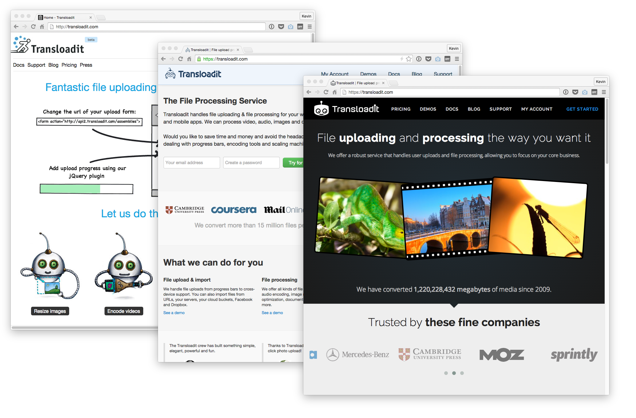
We nevertheless tried many iterations: here are the three main looks of our website and logo in 2009, 2012, and the current one in 2015.
 Transloadit website in 2009, 2012, 2015
As our company grew, so did our understanding that we must acknowledge our weaknesses and surround ourselves with people that outperform us in areas where we fall short.
And so we did. For this website release – nicknamed Shiny – we would like to give a big hand to front-end prodigy Fahad, who took our 2012 site and rebuilt it from the ground up. All CSS and nearly half of our HTML was deleted. We thought that was exciting. 😄
While working with a remote and part-time team sometimes poses challenges, navigating between Basecamp, GitHub, Skype and the occasional meetup, we are very happy about the way things are going.
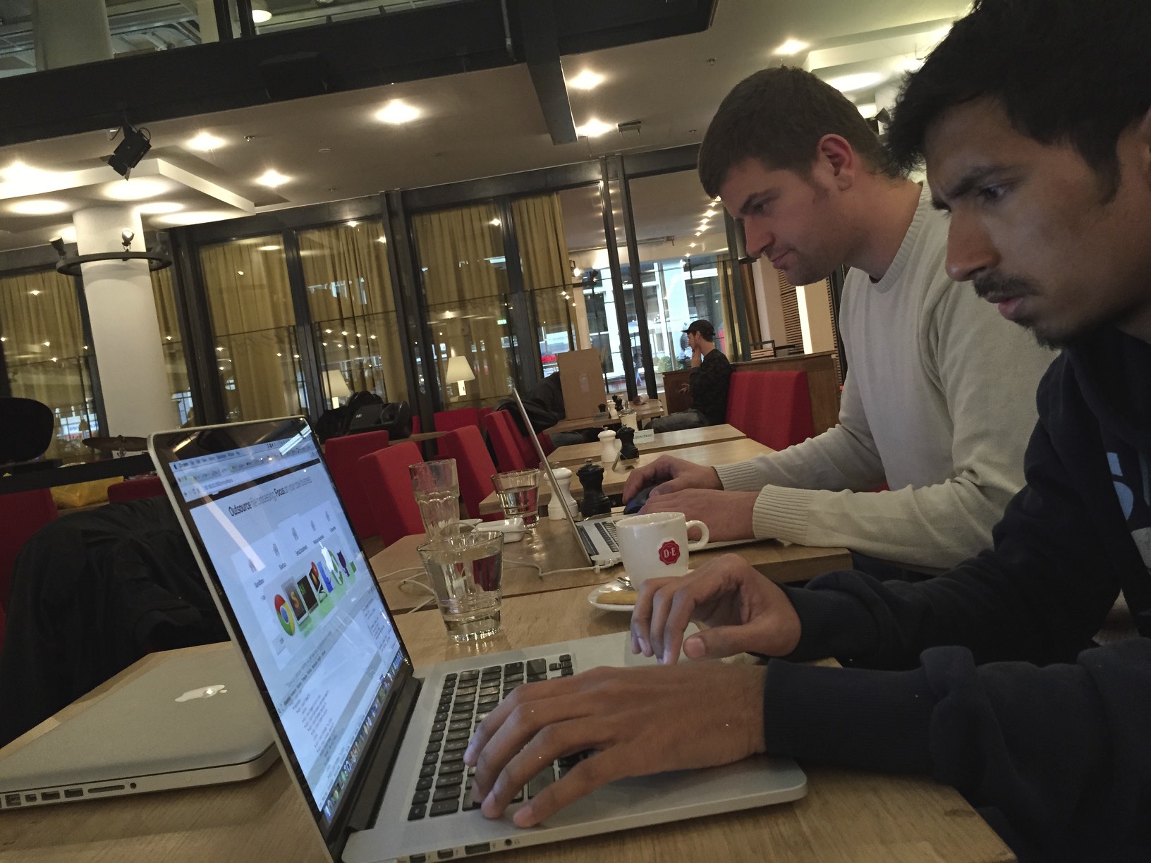
 Fahad deleting our front-end code @ Amsterdam Shiny Hacking Trip November 2014
Before we began work on Shiny, a suite of end-to-end tests on Travis CI was set up first. We wrote CasperJS scripts that would click through the site and execute common scenarios like logging in and editing encoding Templates. This would be automatically executed with every change we made, so it helped to ensure that, as we pushed forward, we didn't accidentally break vital parts of our site.
With every change we made to the 2012 site, we also had to merge that work to - and resolve conflicts in - Shiny. It may have been tedious, but it was the only way we could pull this off and have a good shot at a smooth launch.
Besides Fahad, we owe thanks to Dennis for providing us with his beautiful photography, and Milan for reimagining our logo. The logo still shows one of our playful robots who will happily take encoding work off your hands, but in a simplified stylistic version that we think works better in different sizes and colors.
Finally, we want to express heartfelt appreciation to our whole team. Whether it was by contributing ideas, logos, beautiful photography, or code, everybody played a part and we count ourselves lucky to be surrounded by such a pleasant and talented crew of people.
We hope you will enjoy Shiny as much as we do, and have a little less hurt around the eye area as you're checking up on your latest file conversions. 😄 As always, we would love to hear your feedback.